Theme configurations
4 minute read
Themes live at Admin > Theme Configurations, where you can add a new theme or clone an existing one to start. Each portal has a Default Theme and can also have an Alternate Theme, and a single theme can serve multiple portals.
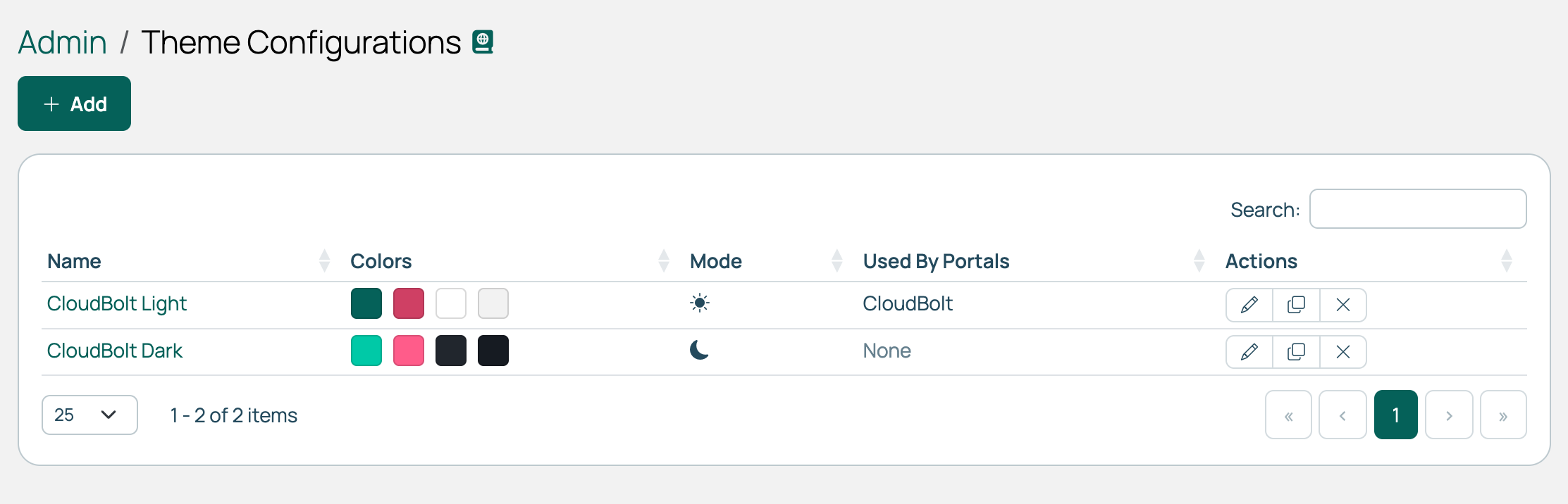 (opens full-size image in a new tab)
Theme settings
Open a theme and edit it to set its name and layout.
| Setting | Description |
|---|---|
| Name | Identifies the theme when you assign it to a portal. |
| Navigation Placement | Whether the main navigation is a horizontal bar across the top or a collapsible sidebar on the left. New themes default to the top. CloudBolt Light and CloudBolt Dark use the left. Users can override this on their profile. |
| Login Layout | Whether the login and other authentication pages use the full-page form (the default) or a centered card. |
| Dark Mode | Marks this as a dark theme. A dark theme starts from a dark color palette, and CMP switches the code editor, syntax highlighting, charts, and status colors to their dark variants. Dark themes show a moon icon on the Theme Configurations list. |
Dark Mode sets the defaults; it does not repaint a theme. To move an existing theme onto the dark palette, select Dark Mode, then select Reset all colors to defaults on the color forms.
Light and dark mode for users
To let users choose between light and dark mode, give the portal an Alternate Theme in the opposite mode to its Default Theme. See Branded portals. The out-of-the-box CloudBolt portal pairs CloudBolt Light with CloudBolt Dark.
Users then switch with the Dark Mode toggle in the user menu or on their user profile, and the choice is saved to their account. Users who have not chosen a theme, and pages shown before login, use the Default Theme. If the Alternate Theme is removed, everyone sees the Default Theme.
Users can also set Navigation Placement to Top or Left when they edit their profile, whether or not the portal has an Alternate Theme. Their choice overrides the theme’s setting.
Basic colors
Set these colors first. Enter each one in hex, such as #000000, or pick it from the color square.
| Color | What it colors |
|---|---|
| Primary | The main brand color. Drives buttons, links, active tabs, pagination, and other call-to-action elements. |
| Highlight | Marks something as needing attention, such as the setup wizard’s Continue setup pill. This is not an error color. |
| Banner Background | The band above the top menu, behind the portal’s banner image. |
| Top Menu - Background, Top Menu - Text | The top menu bar and its text. |
| Page Background | The main page area, behind the cards and panels. |
| Surface (Cards & Panels) | Cards, panels, tab panes, and other surfaces that sit on the page background. |
| Content Text, Heading Text | Body text and headings. |
| Tooltip Background, Tooltip Text | Tooltips. |
The basic form also includes an Update Advanced Colors checkbox. Select it to recalculate the advanced colors from the basic ones, discarding any previously set values.
Each color form also has a Reset all colors to defaults button, which clears every color on that form so it falls back to the theme’s palette.
Advanced colors
Each of these is derived from one of the basic colors. Leave one empty to keep it derived; fill it in to override it.
| Color | What it colors | Derived from |
|---|---|---|
| Top Menu - Hover, Top Menu - Active | A top menu item under the pointer, and the one for the page you are on. | Top Menu - Background |
| Security Background | The security message, if one is set in Miscellaneous settings. | Page Background |
| Security Text | The text of that security message. | Content Text |
| Email Background | The background of emails sent in this portal’s context. | Top Menu - Background |
The theme’s detail page includes a Preview panel that shows a CMP catalog page and updates as you change the theme.
Clone or delete a theme
Cloning copies a theme’s settings under a new name.
You can delete a theme once no portal uses it as its Default Theme or Alternate Theme. Reassign those portals to another theme first.
Related
- Branded portals: Configure the domains, logins, images, and splash screen.
- Email templates: How portal and theme branding reach the emails CMP sends.