Branded portals
3 minute read
See Theme configurations for designing color schemes that can be used across portals.
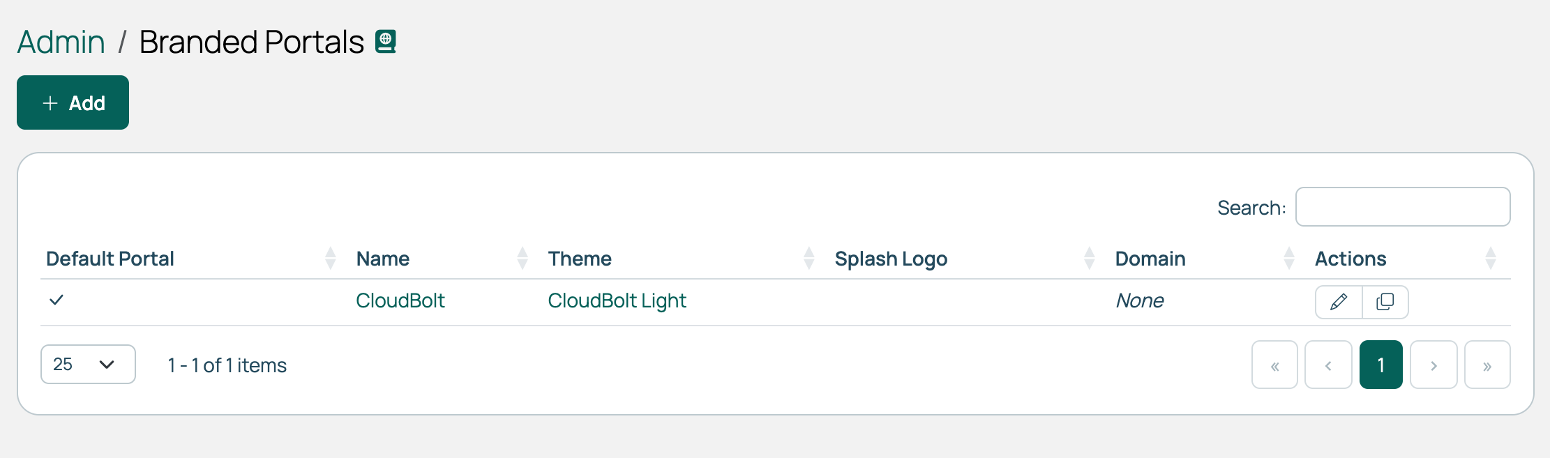 (opens full-size image in a new tab)
How CMP chooses a portal
Each request is matched against the Domain/IP of every portal. If none match, the default portal is used. One portal must always be the default, and the default cannot be deleted.
The portal’s Name replaces references to CloudBolt anywhere a non-admin can see them, and its images replace the ones in the header, the loading indicator, and the splash screen.
Create a portal
- Go to Admin > Branded Portals and select Add.
- Complete the form and select Create.
| Field | Description |
|---|---|
| Name | Identifies the portal and is the name shown to users in place of CloudBolt. |
| Domain/IP | The address users use to reach this portal. CMP matches incoming requests against it and uses it when generating links. |
| Login LDAP Domains | The LDAP domains offered on this portal’s login page. Leave empty to offer all. |
| Local Credential Store | Whether accounts held in CMP can log in here. Inherit follows the global setting on the LDAP authentication page. |
| Default Theme | The theme supplying this portal’s colors. One theme can serve several portals. |
| Alternate Theme | Optional. A theme in the opposite mode to the Default Theme, so users can switch between light and dark mode. See Light and dark mode for users. |
| Default Portal | Makes this the portal used when no domain matches. |
A Tenant field also appears on a non-default portal when multi-tenancy is in use, linking the portal to a single tenant.
If you change the Default Theme to the same mode as the Alternate Theme, the Alternate Theme is cleared when you save.
Images
Open a portal and edit its images.
| Image | Where it appears |
|---|---|
| Top Banner | A band above the top menu. Up to 80px tall works best. |
| Top Menu Logo | The logo in the top menu. 108px tall works best. |
| Splash Logo | The logo on the login screen. Use one with a transparent background. |
| Splash Image | The background image on the login screen. At least 1080px tall works best. |
| Loading Image | Shown while pages load. 244px tall works best. |
| Email header image url | The header on emails sent in this portal’s context. Give a publicly reachable URL so mail clients can fetch it. 700px wide works best. |
Splash screen
The splash screen is what users see before logging in. Edit its settings on the portal, and use the login preview to check the result.
| Setting | Description |
|---|---|
| Splash Title, Splash Tagline | The heading and the line beneath it. Both are optional. |
| Splash Image Position | Where the background image sits. Takes any valid CSS background-position value. |
| Splash Text Color | The color of the title, tagline, and links over the image. |
| Enable Overlay Color for Splash Image, Overlay Color for Splash Image | Tints the image so text over it stays readable. The color applies only while the first setting is enabled. |
| Show Privacy Policy link, Show Terms of Use link | Whether each link appears on the login screen. Each has its own fields for the display name and the URL. |
Clone or delete a portal
Cloning copies a portal’s settings under a new name, including a copy of its Default Theme. The clone uses the same Alternate Theme as the original. The clone is never the default.
You can’t delete the default portal: make another portal the default first.
Single sign-on
A portal can offer a single sign-on provider on its login page. You make this association on the provider, not the portal. See Single sign-on and SAML.
Related
- Theme configurations: The colors, dark mode, and layout choices.
- Email templates: How portal branding reaches the emails CMP sends.
- Single sign-on and SAML: Setting up the providers a portal can offer.
- LDAP authentication: The domains a portal can show.